

NS Will Switch All Station Boards to Dark Mode by Late October
New dark-blue displays aim to boost readability and cut power use (up to 30% with new screens), with bullet-style alerts and limited multilingual announcements to follow.

Before we begin, a quick shoutout to our sponsor, Signaal:
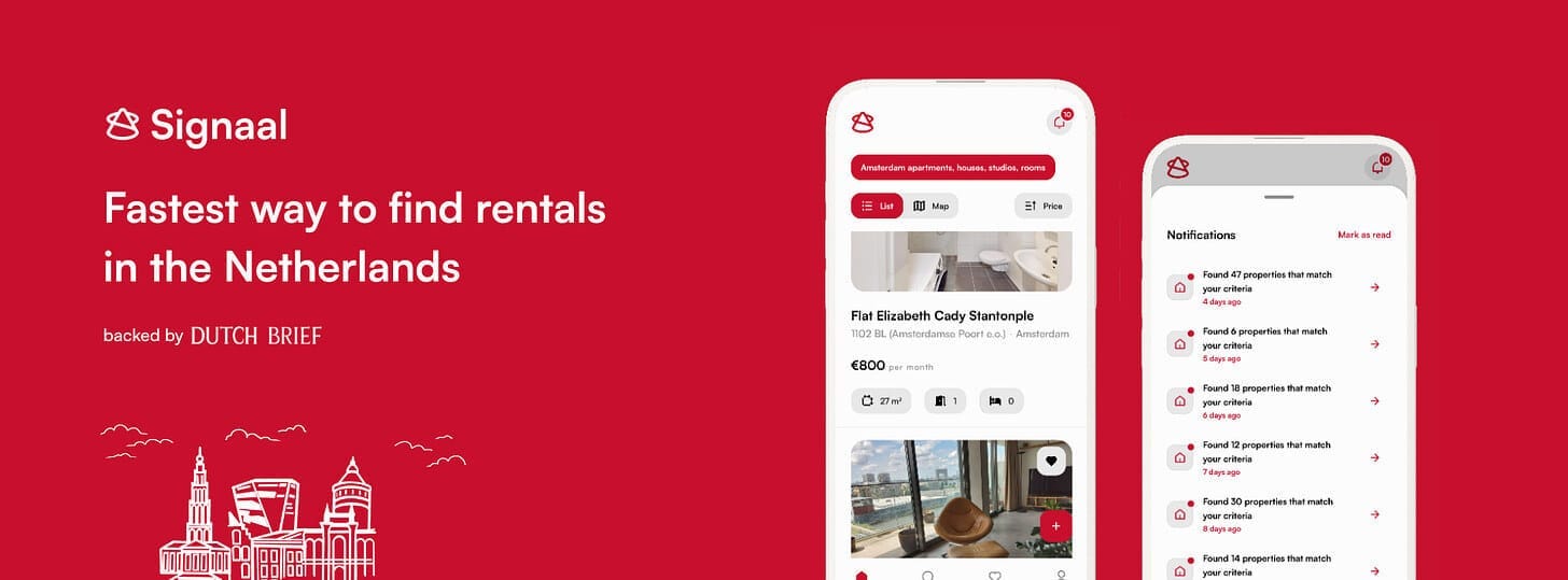
Looking for housing in the Netherlands?
Signaal helps you skip the endless scrolling by tracking new listings from trusted platforms and alerting you when something matches your needs, all in one easy-to-use app.
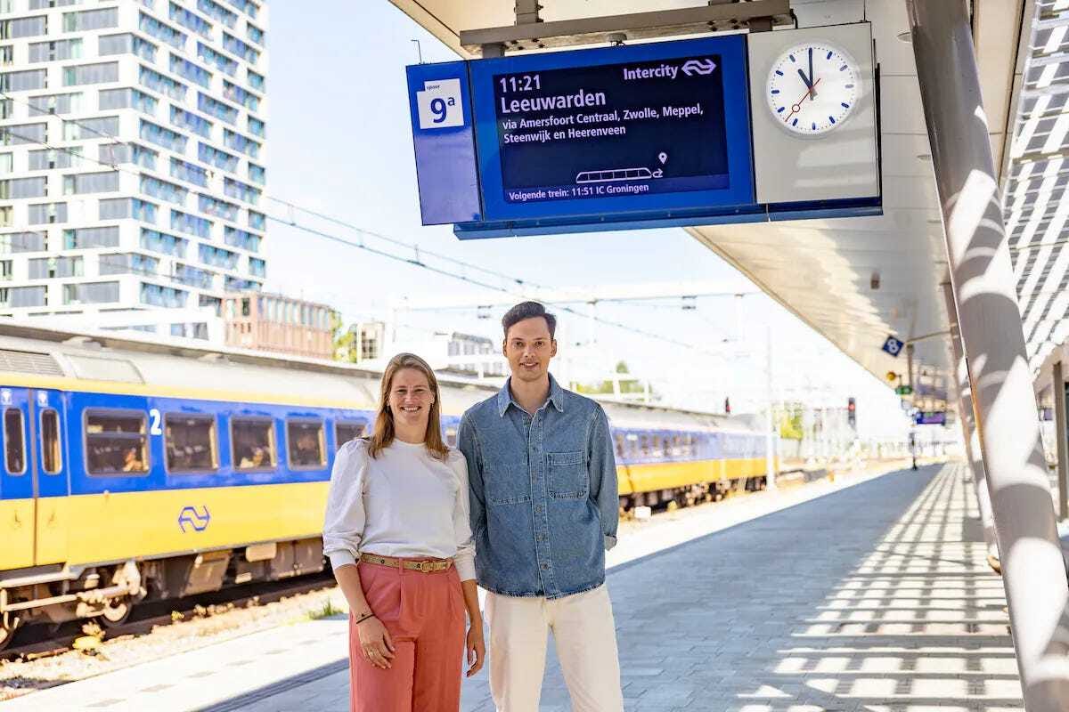
By the end of October, NS will switch ~3,600 information screens at nearly 400 stations (NS and regional operators) to a dark theme: dark blue background with white text and yellow for disruptions. The first live test ran at Utrecht Centraal, where the look changed mid-morning as technicians pushed the update.
Readability and Accessibility
NS says the darker palette is more calming and easier to read, especially for people with colour-vision impairments (about 1.3 million people in the Netherlands), and it is validating contrast choices with low-vision experts during the rollout. The same style will appear on concourse boards, not just platform screens; the shade can look almost black outside and lighter indoors, so NS is testing legibility at different viewing angles and light levels.

Energy Savings
Dark mode also reduces power use. NS expects about 5% electricity savings immediately, rising toward ~30% once ProRail replaces older units next year with newer displays that include ambient-light sensors for automatic brightness. This aligns with ProRail’s broader energy-saving initiative (e.g., sensor-controlled LED lighting at stations).
What Else is Changing
The scrolling “disruption bar” will be redesigned into short bullet updates for quicker scanning. NS is also considering more multilingual announcements (English/German/French) at stations with many international travellers, balancing usefulness with the risk of audio overload. The passenger group Rover has been briefed yet no major objections have surfaced so far.
Reactions and Next Steps
Early passenger reactions are mixed: some find it much clearer, others were startled when a board suddenly “went black” during testing, but NS reports broadly positive feedback from riders, staff, and accessibility stakeholders. Expect the nationwide switch by late October, followed by continued fine-tuning of colours, contrast and fonts as new hardware comes online in 2026.